Date: Winter 2022
Partner(s): Bridger Rives
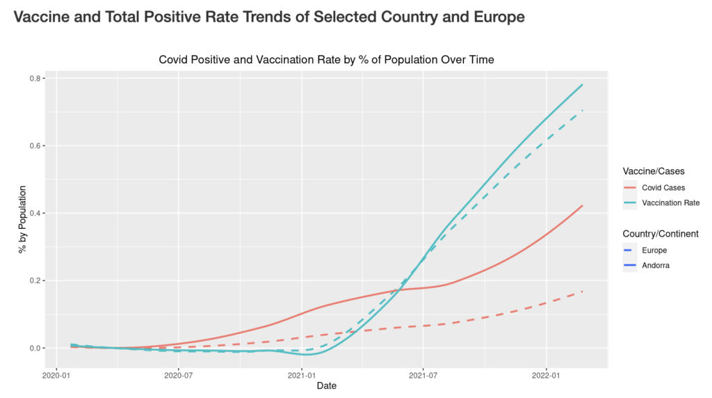
This project, an interactive tool built with Shiny in R, explores trends in coronavirus positives and vaccinations in Asia and Europe. It displays the top and bottom four countries by positive covid and vaccination rates in a user selected year and a chloropleth (or heat) map of the relative covid positives or vaccinations in each country in Europe and Asia. In creating this project, I learned how to build tools and interactive visualizations in R.
