Categories
Data Visualization

“Let every word weight heavy of her worth”: Examining How Women Enact Power in Shakespeare’s Comedies through Interactive Speech Pattern Visualizations

Date: Winter 2022

Threads: Data Analysis, DH Feminism, Data Visualization, Distant Reading, Open Data, Humanities Visualization

View this project here

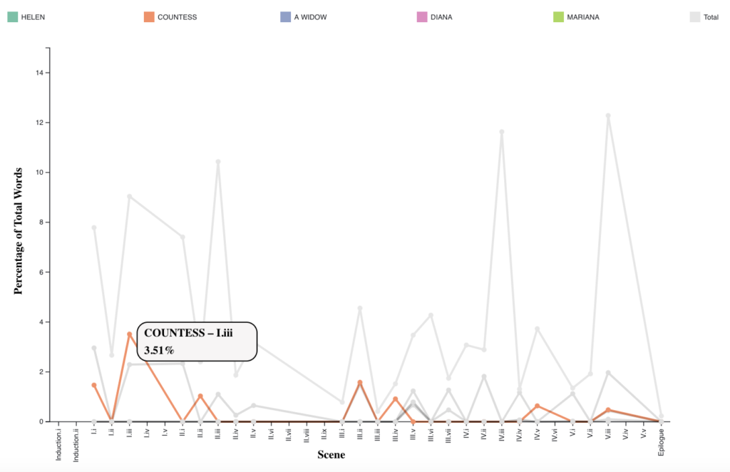
This project was my senior thesis for the English major. In it, I analyzed how women enact power in Shakespeare’s comedies by visualizing their speech patterns. I hand-annotated each comedy for who talks to whom, designed and coded visualizations to present the speech pattern data, and then wrote an essay analyzing the visualizations and contextualizing my work within previous literary and DH analysis of Shakespeare. This is the largest research project I have undertaken solo and it allowed me to execute a project from conception to execution. It was also the first time I explicitly used a feminist lens in creating and analyzing a visualization. This work is set to be published as part of the QuaDramA workshop proceedings in September 2022.

Categories
Data Visualization

Examining World Energy Production and Usage

Date: Winter 2022

Partner(s): Bridger Rives

View this project here

This project, another interactive tool built with Shiny in R, examines energy consumption and generation trends by continent. In particular, it looks at energy consumption and generation from renewable versus fossil fuel sources using machine learning (in particular random forests), chloropleth maps, and interactive bubble charts. This project allowed me to further develop my ability to create apps and interactive visualizations with R. It also gave me further experience integrating several kinds of data analysis into a cohesive argument.

Categories
Data Visualization

Exploring Continental Vaccination Data

Date: Winter 2022

Partner(s): Bridger Rives

View this project here

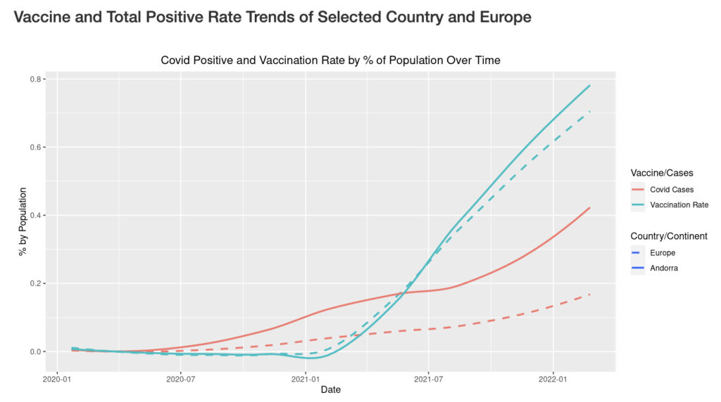
This project, an interactive tool built with Shiny in R, explores trends in coronavirus positives and vaccinations in Asia and Europe. It displays the top and bottom four countries by positive covid and vaccination rates in a user selected year and a chloropleth (or heat) map of the relative covid positives or vaccinations in each country in Europe and Asia. In creating this project, I learned how to build tools and interactive visualizations in R.

Categories
Data Visualization

“What care I for words?”: Visualizing Characters’ Speech in As You Like It

Date: Winter 2021

View this project here

In this project, I studied characters’ speech patterns in Shakespeare’s As You Like It. I hand-annotated the play for who talks to whom and then designed and coded a visualization that is meant to facilitate an explorative analysis these speech patterns. This project was the first time I created a visualization intended to facilitate literary analysis and it served as the starting point for my English senior thesis project.

Categories
Data Visualization

Biodiversity in National Parks Visualization

Date: Winter 2021

Partner(s): Shannon Liu

View this project here

This interactive visualization allows for the exploration and comparison of biodiversity data in coastal and inland national parks. We designed the visualization from scratch for this particular dataset and used the D3 library in Javascript to implement the visualization in Observable. We facilitated several forms of interaction to help users with their exploration. This project allowed me to gain further experience designing visualizations that prompt users to explore answers to a particular question.

Categories
Data Visualization

Most Common Baby Names in the US Over Time Visualization

Date: Winter 2021

Partner(s): Shannon Liu and Maddie Kyhl

View this project here

This project prompted my partners and I to critique and then redesign an existing visualization. The visualization displayed data on the popularity of baby names throughout US history. This was the first large-scale project I undertook in the interactive notebook tool Observable using the D3 library in JavaScript, a tool I have frequently used since. It was also one of my first experiences thinking about what the affordances of digital visualizations are and how best to facilitate user exploration of a particular dataset. Additionally, this was the first time I was involved in designing an interactive visualization.

Categories
Data Visualization

Reading Abstracted: Visualizing Routines

Date: Winter 2021

View this project here

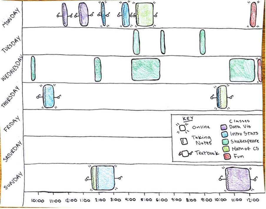
This essay describes a visualization I designed and hand-drew. The visualization depicts data I collected on my own reading habits over the course of a week. This project, inspired by the Dear Data project created by Stefanie Posavec and Giorgia Lupi, was my introduction to designing specialized visualizations for specific datasets, a concept that has been central to much of my DH work since.

Categories
Data Visualization

Word Clouds in the Wild

Date: Summer 2020 – present

Partner(s): Maanya Goenka

The broad goal of this project is to determine how word clouds are being used in various arenas such as digital humanities and journalism, with the eventual goal of creating visually pleasing but effective word clouds. Along with Professor Eric Alexander and Maanya, I used grounded theory (a method of qualitative data analysis that involves hypothesis formation through data collection) to study word cloud usage in digital humanities academia and journalism. I then analyzed the collected data. This is the first long-term research project I have been involved in, and we are currently writing up the results of our survey for publication.

Categories
Data Visualization

Co-Taught Class Network

Date: Winter 2019

Partner(s): Nicole Connell and Brooke McKelvey

For this project, my partners and I hand-processed old Carleton course catalogs to determine which professors in which departments frequently co-teach classes. We then input this data to the network creation software Gephi to visualize which professors and which departments have most frequently co-taught classes in the past and which departments often co-teach classes with each other. This was one of my first experiences with processing large amounts of text data, a trend that’s continued throughout much of my digital humanities work.

css.php